KODA's been getting out and about quite a bit lately. One of my favorite activities is biking along the Barton Creek Greenbelt. I've been recording most of my adventures on my SUUNTO Ambit GPS watch, but haven't been able to do anything with the data as I lost the cable. Every time I get interested in the data I realize that a replacement cable is a week away, and I lose momentum - well, until last week.
I finally ordered a new USB cable and have spent the last few days playing around with it. Downloading the data was top priority. As soon as I plugged it in the MovesLink application started gobbling up files. The program nearly screamed at me for being at least two years out of date with firmware upgrades... I never had to worry about that with my old-school Casio!
DaAta
Based totally online, the MovesCount application categorizes all my Moves (lingo for 'exercise' etc) by date and type of activity.
It's a really nice interface - one that people designing monitoring data systems could probably learn a lot from. It is fast, lush and intuitive. (Side note: Google Analytics, and SquareSpace also have really nice graphing and charting aspects to their systems...)
Here's where a conversation about 'data' vs. 'information' starts to emerge. In this case, the lowest level of data is GPS coordinates, stored every second. From here the program generates more useful forms of data: pace, speed, ellipsoidal height change etc. But, in doing so, do we still just end up with more data? Are we any closer to having information? I think that depends on your objectives, and how the information is presented to you...
Information is Conditional
...so, does that mean that data becomes information based on the desires of the user? Is it a transient, changing state in which data is at one moment able to be considered informative, but the same data type, for a different route is not? What am I talking about? Consider three of my most memorable Moves: 1) Greenbelt Mountain Biking, Austin, 2) Ubud Cycle Trip, Bali, 3) 28km Hike in which I nearly had to sleep in a field because the hostel closed at 9pm, Spain.
Looking back nostalgically on each of these Moves I started to find that I was interrogating the data in different ways. For the Greenbelt I started to compare this week to last week, to last month. This is because I'm able to regularly visit it, and use it as training. I want to see if I'm getting fitter, more skillful, and in a couple of areas where the trail is not well defined, am I finding the best route.
For the Bali data I wanted to see my maximum speed and also all the places we stopped so I could properly label a few photos with the name of the town I visited.
For Spain I was interested in just how close I was to being locked out of the hostel. Surprisingly, this was the hardest thing to extract from MovesCount. I had to take the start time and add the length of exercise to get the finish time. Is this a case of over-refinement of data? All I wanted was the finish time - the time of the last logged point - but that had been obfuscated from me in the refinement process.
In case you're wondering, It looks like I was four minutes late. Pretty good for a hike that started over 5 hours earlier, 29km away. I remember running 200m, walking 200m for a few kilometres just to increase my average speed. Seeing that reflected in the data put a smile on my face - it was worth it.


How does this apply to KODA?
At a more micro-level, think about how different users, including yourself, might want to look at the data from your project. An example that comes to mind is from the rail geometry monitoring world. Most of the time everybody is talking about Top, Line, Twist and Super except when there is a problem. For the surveyor there's nothing more valuable that having Easting, Northing and Height easily available so that can see what is driving the error. In some cases, Hz, Vt and Slope distance are more useful as they are the data upon which the least interpretation and correction has been performed. An error in refraction or first velocity correction data might be driving the problem, so plot them too.
So what are my recommendations? As data users, manipulators and presenters try to anticipate the needs of your audience so that the data you present is useful as information for them. At a macro-level, try to question yourself every time you think: "That's what the last client wanted" or "That's what this client wanted on the previous project".
Best USB port ever
Since losing the cable I've been charging the watch with a Frankenstein'ed USB cable and clip that I found in the kitchen drawer. (Note - For fear of short circuits I trimmed the data+ and data- lines.)
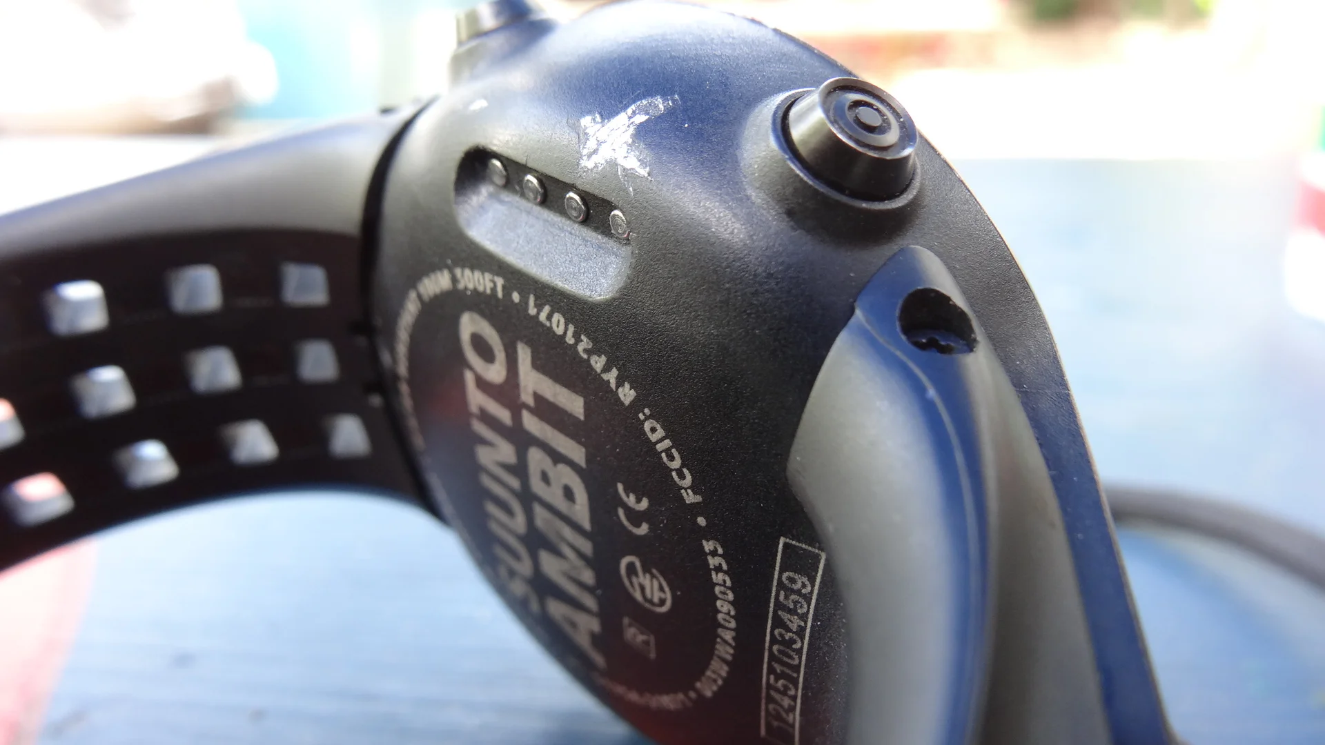
If you've never seen the back of a SUUNTO watch before check out the photos in this article. The watch has four exposed brass (?) pins which a special clip connects to. This charges the watch but also provides the USB connection so you can download your data.
It's perfectly designed for getting dirty, getting sweat on and submerged, then when you get home clip on the cable and download.
Up for a beating
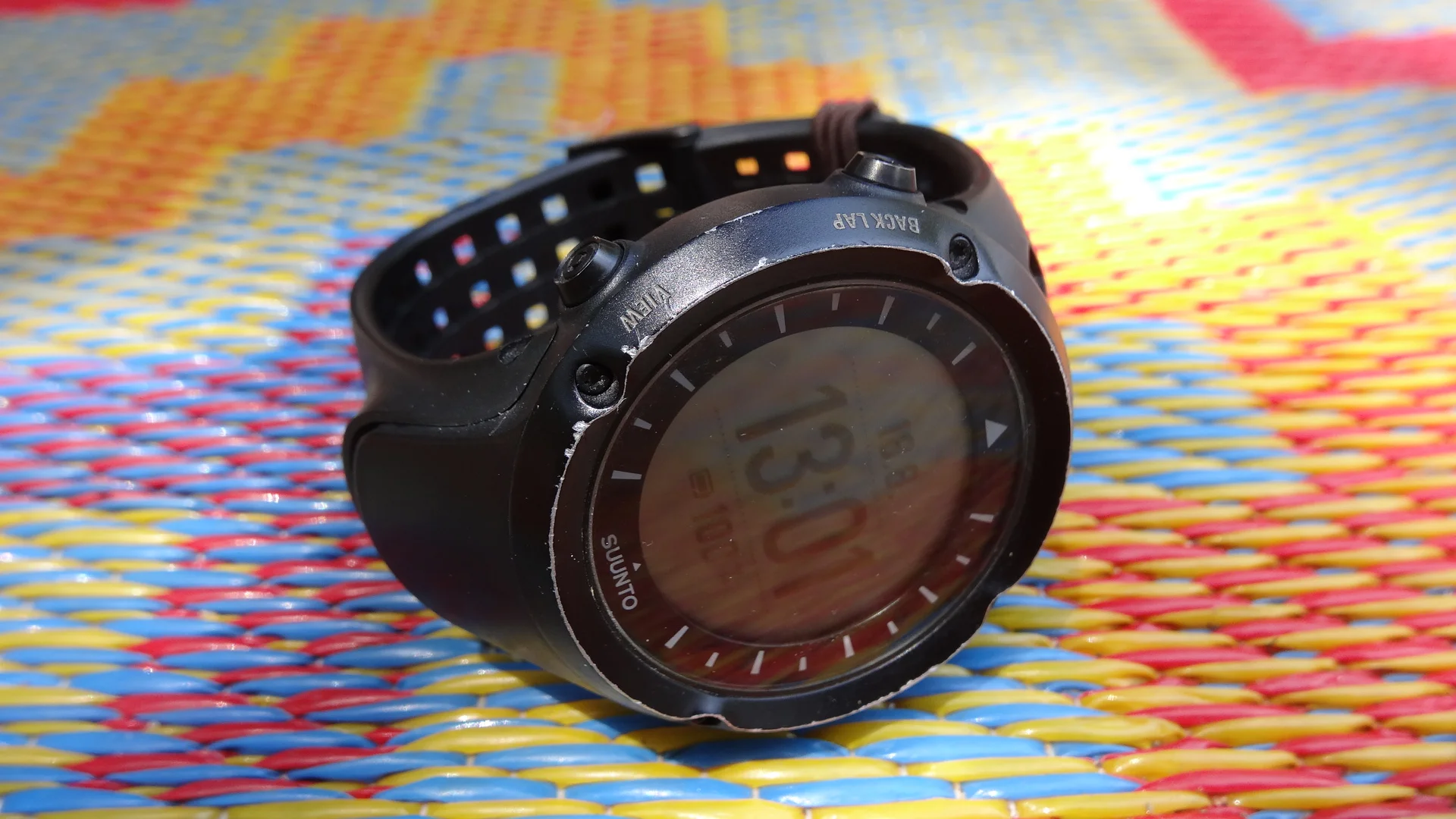
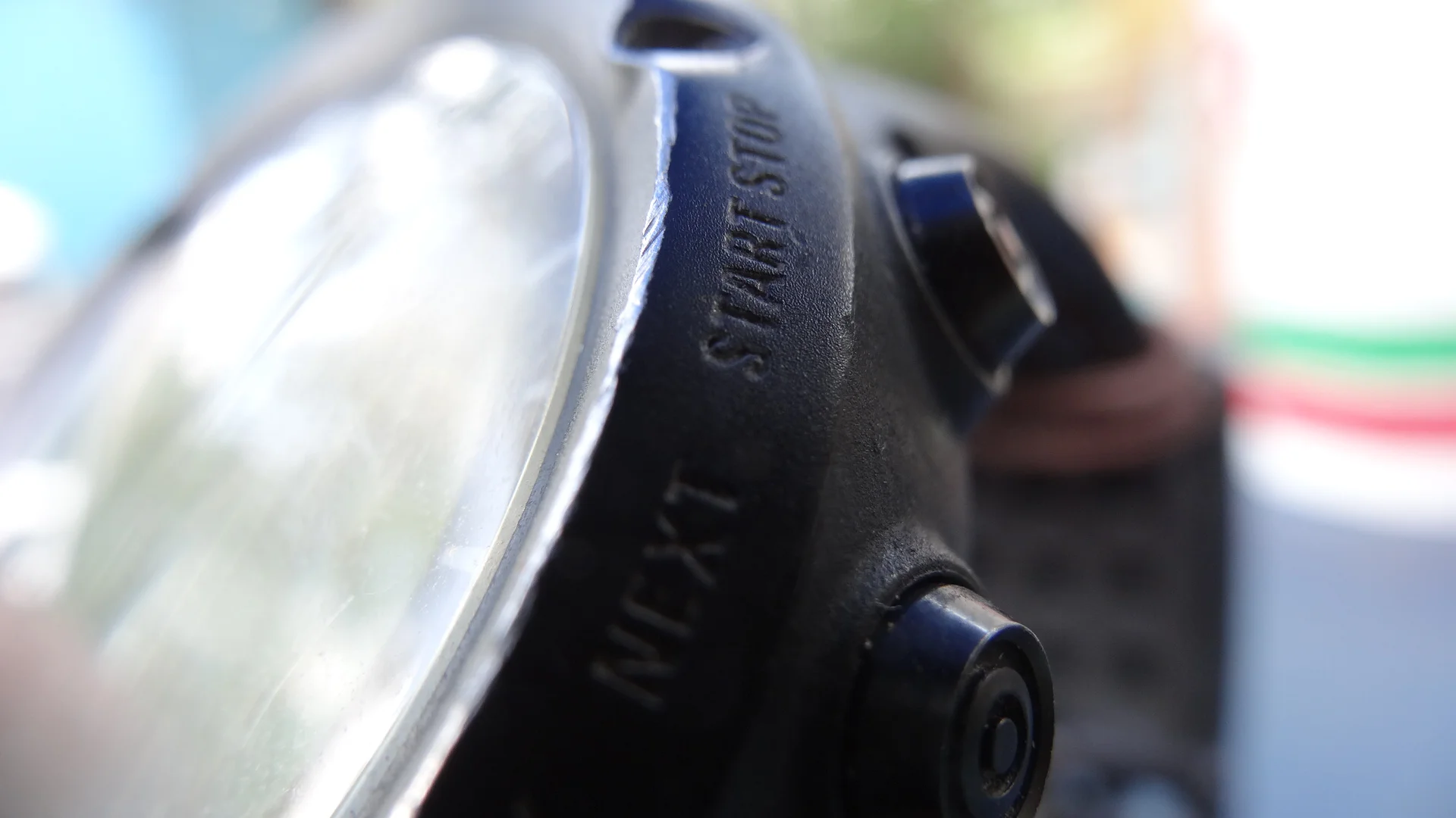
You'll see in some of the photos that the watch has taken a beating since I got it. A hair band now replaces the strap clip, and the bevel around the face shines a bright aluminium from beneath the typically matt black exterior. I like it though. It says: "I've been places. Do you want the waypoints, temperature, pressure and 3D compass bearing to prove it?"
I hope you enjoyed this post. Until next time.
KODA

